

We are BEEing different

The identity of a brand reflects its internal and external processes aiming to display them in the light of what the brand is and how it wants to be presented to those who are just getting to know it.
At first, we were only sure of one thing: we wanted to do a rebranding and we wanted it to reflect all that we went through since the founding of the company – development, individual and collective growth, expansion of the company as well as the range of technologies we offer to our clients. We also knew we wanted to be out of the ordinary and completely authentic.
We did not only aim to present the brand in a new way to those who know us or even those who are just getting to know us but also to follow industry trends which we also incorporate into each service segment.
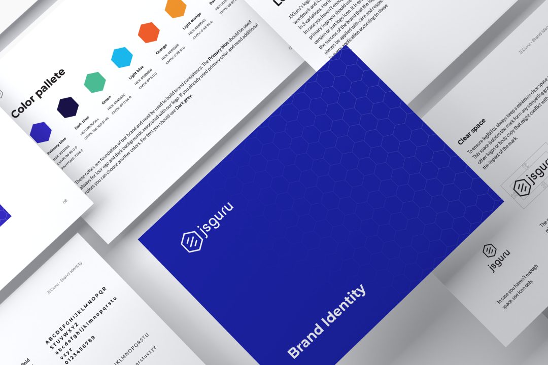
As is usually the case in most business spheres, the ones offering services will find it hard to apply those services to themselves because they put themselves last. So, our website development took longer than planned, the brainstorming meetings were often unproductive, but we didn’t give up. It went on all until one meeting where we considered whether and how to change our basic symbol – the hexagon. A form that is present in geometry, religion, esotericism and nature had to be adapted to modern-day industries. It is considered to be a symbol of harmony and balance. The hexagon is present in Judaism as the Star of David, as the Tree of Life in Kabbalah, as well as in Nordic runes.
We can find this form not only on Earth but also in space. One of the more fascinating discoveries by the NASA Voyager and Cassini missions is that the dust cloud around Saturn has the shape of a hexagon. In nature, the hexagon is also one of the basic patterns that are repeated as a model or basis of many forms, such as the structure of DNA.
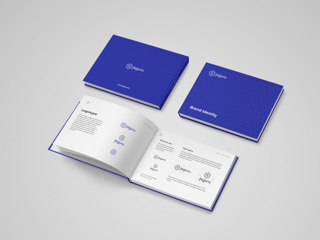
It was a unanimous decision not to change the shape of the logo. All we had to do is agree on how to enhance it and supplement it with additional visual elements. Then, somebody had the idea: beehives have a hexagon pattern!
A beehive came as a great concept which reflects our work environment, but also us. Of course, there were many bees and bumblebees jokes throughout the process, potential bee mascots, optimizing the queen bee process and so on. The great humor of the rebranding team gave birth to some great ideas that were integrated into the new identity.

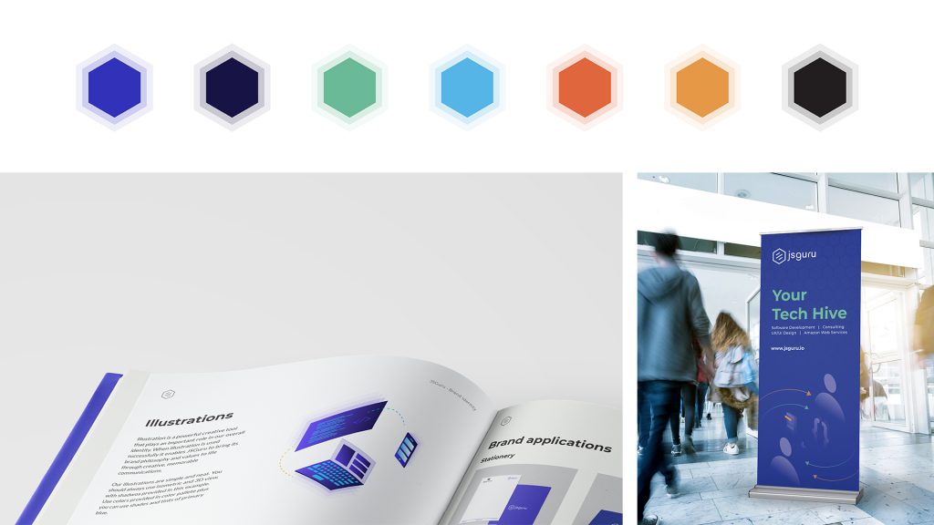
The entire graphic identity we created as part of the rebranding process is based on the beehive pattern. That was our starting point for the tagline “Your tech hive”.
We were guided by a modern, simple and elegant design. We tried to retain and upgrade colors that were previously in use, but this time we added brighter and more vivid tones that would reflect our work atmosphere as well as the company culture in general, permeated by young, motivated and creative people.
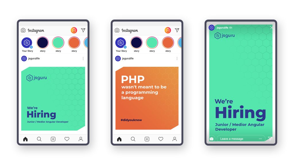
We have added new vibrant colors to open up the ability to differentiate various services, as well as differentiate categories of posts on social networks. By creating new custom-made illustrations for our needs, we have made a unique way of presenting different processes and services.
Every creation takes time and a matured idea; its structure made up of small parts that we do not see at the beginning. Yet, in the final version, we completely become aware that it has always been there as a part of a bigger picture that we may not even have had to see right away but should have reached through the catharsis of a creative spirit.